Tagline ranking agency identity
This is the first Russian analytical agency exploring digital-production markets, interactive marketing and the accompanying services.
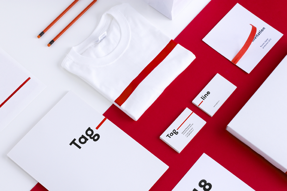
Tagline needed a completely novel, easily recognizable and modern style. The approach to its visual design had to be more organized and neat.

Cut-off
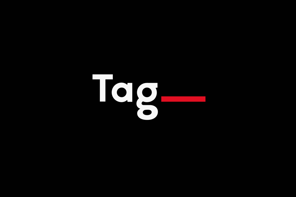
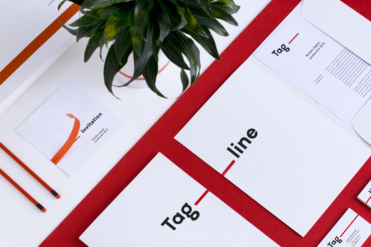
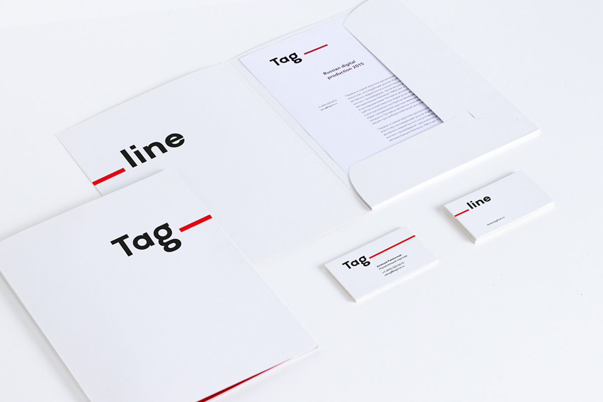
There used to be two logo alternatives: primary Tag__ and supportive Tag__line. The red line is easily read like the word ‘line’, so we recommend using the basic alternative of the logo.
Adaptive
The logo’s structure allows easy branding of the conference names and agency ratings.
It’s a decent step into the next decade. New Tagline is so special and bright!
Sometimes the second part of the logo can be found on the other side.


The line
Tagline will be instantly recognized anywhere and everywhere thanks to the red line.


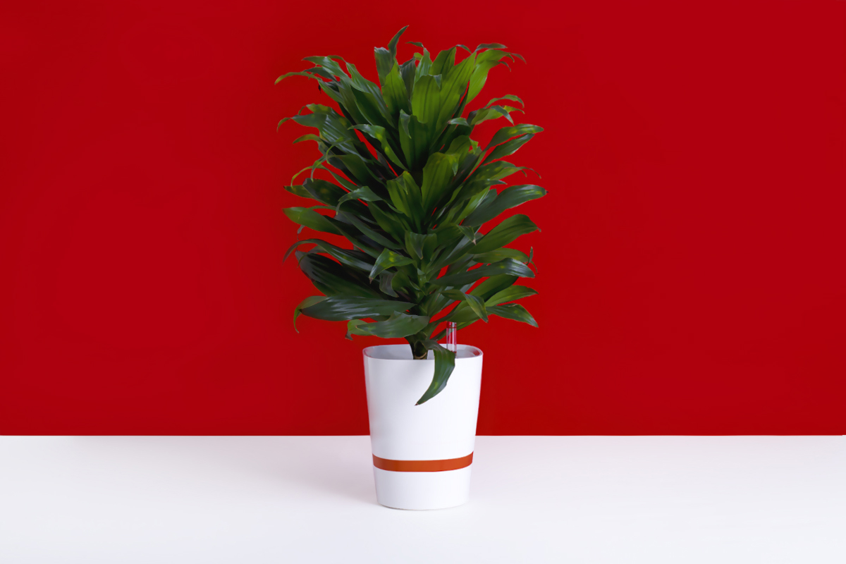
Specially filtered pictures are meant to advertise ratings and conferences.
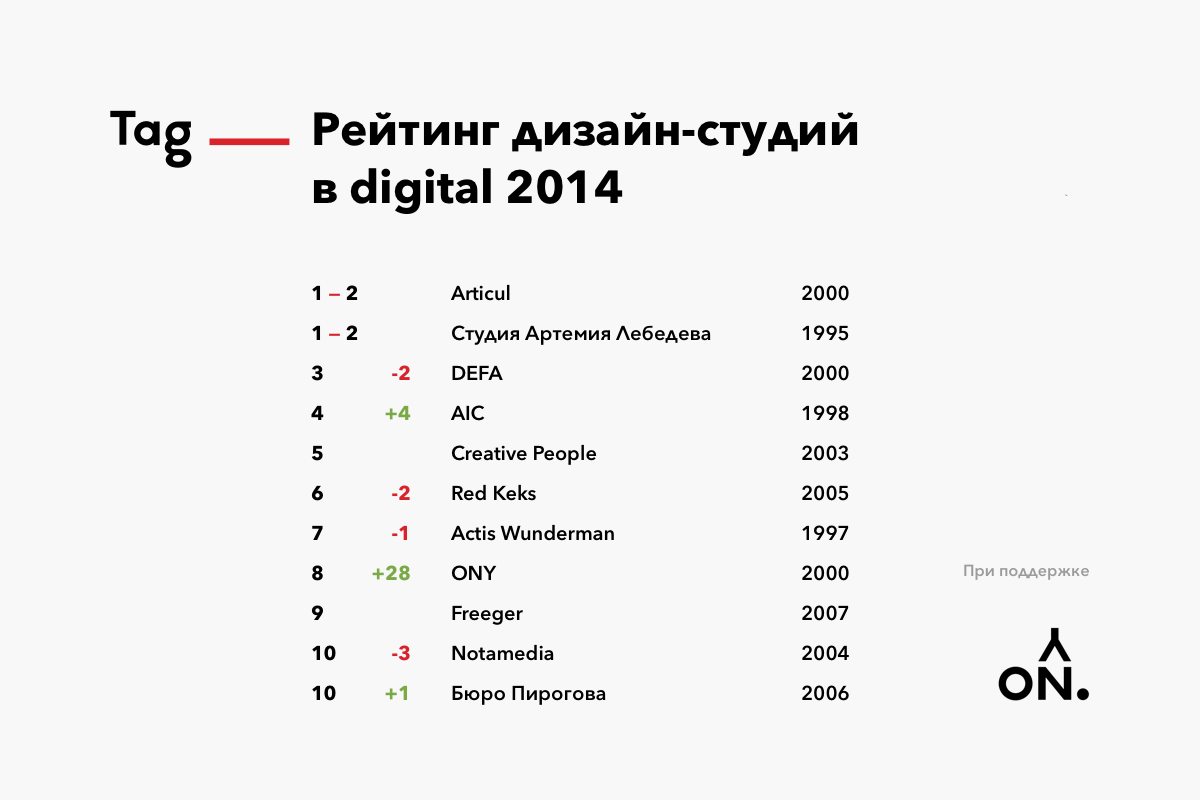
The Top 10 rating’s announcement design is very modest and without unnecessary details. This slide will do perfectly for both a projection device or a Facebook post.
The adverts and presentation slides are designed in a unified grid which eliminates any differences in margins and makes work easier for a layout specialist.
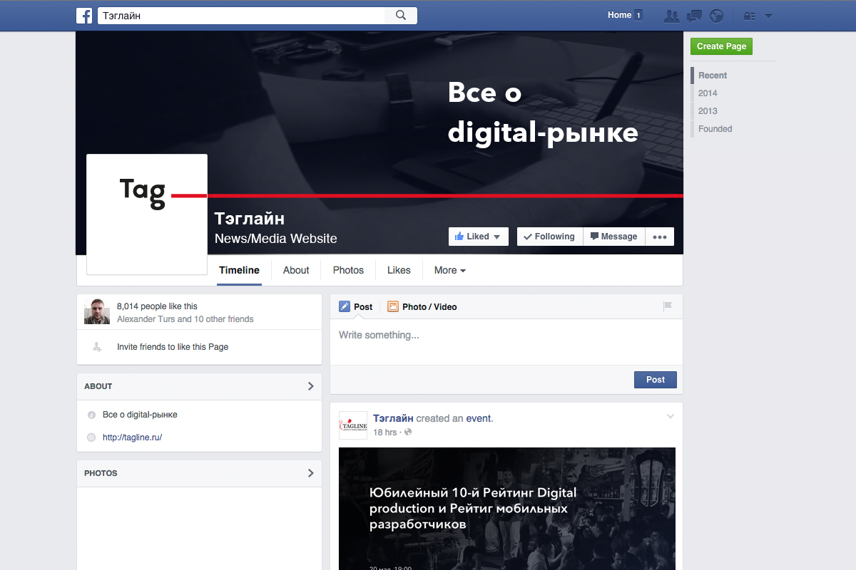
Tagline’s official Facebook page.
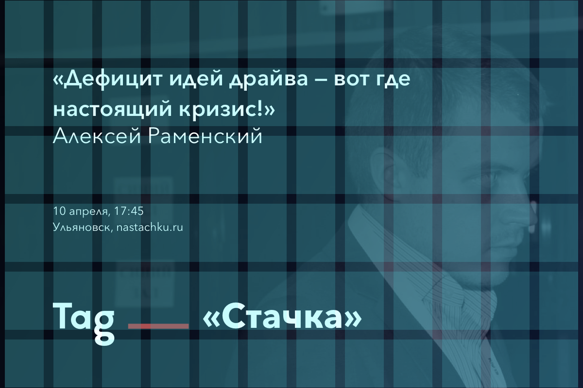
No more amateur performances. Here we see a nice-looking, stylish and welcomed rating sign in plain sight. Any studio would be proud of it.
Easy and effective branding even if nothing is there. ;-)
The new logo and corporate style is not officially accepted or used by Tagline. This complete rebranding was performed solely on Scada design studio‘s own initiative, inspired by the anniversary rating. We are willing to give Tagline the right of this work’s use pro bono.