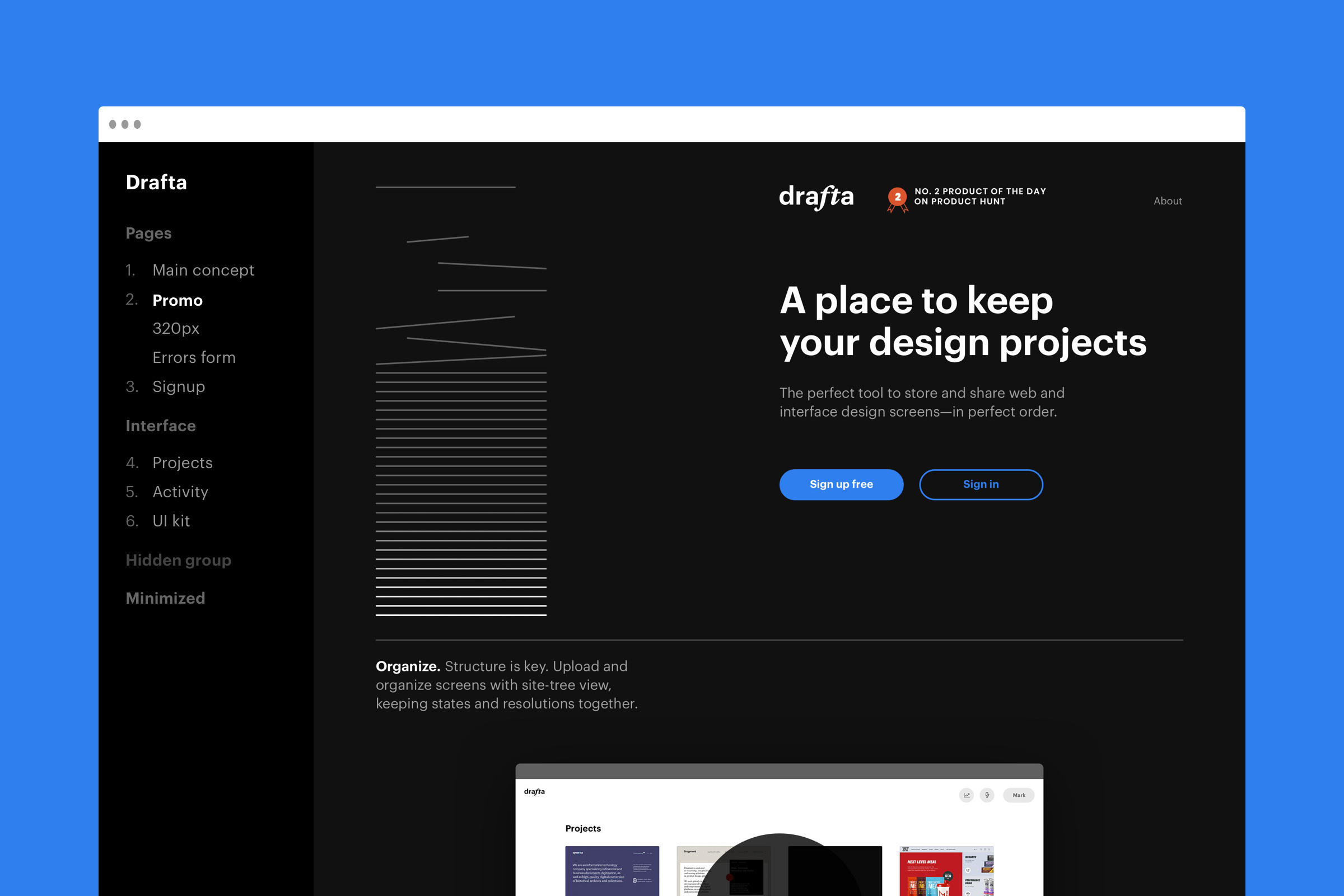
The most relevant version of the design was always at hand and designs did not get lost in the correspondence with clients.
Each design version had a unique URL that could be pasted into any document or an email. The designs from Drafta were displayed in the browser correctly and worked well with retina.
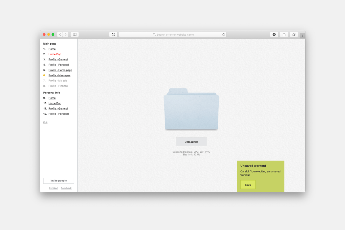
We used Drafta for 5 years and it was so convenient that we decided to share the product with everyone.
Before making it public, we reworked it. The developers did some React magic and the designer adapted the interface for new use cases.
Interface
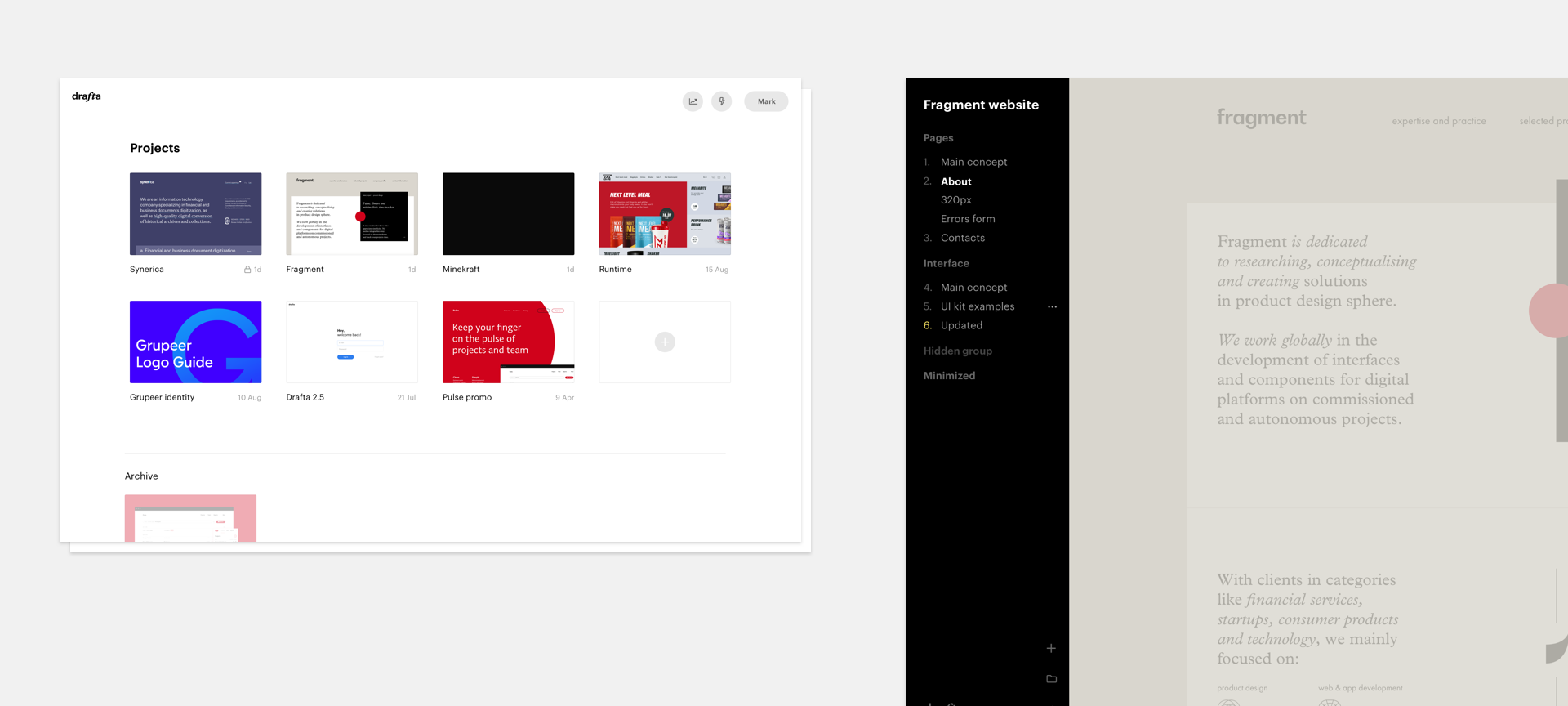
As we were making a product for designers, we knew we couldn’t cut corners either in UI or design as the “early MVP” excuse simply wouldn’t work with these guys :-)
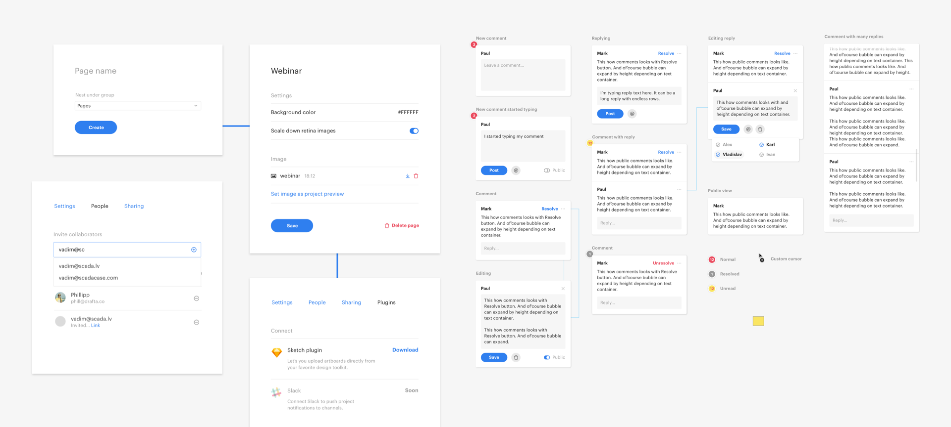
In the earlier versions, Drafta had two toolbars: the public one and the one the administrator used to add and sort designs. In the new version, we decided to merge the toolbars into one.
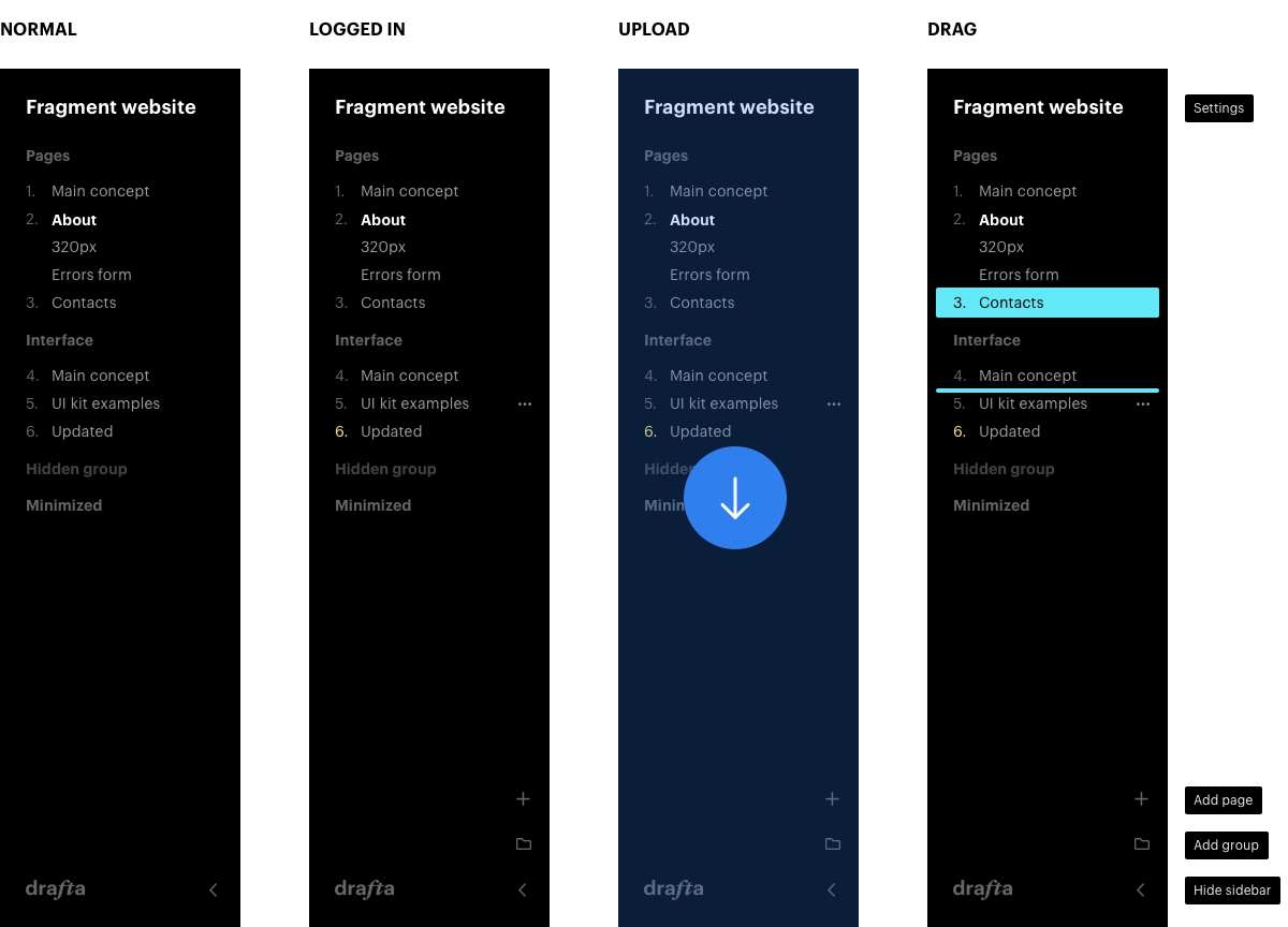
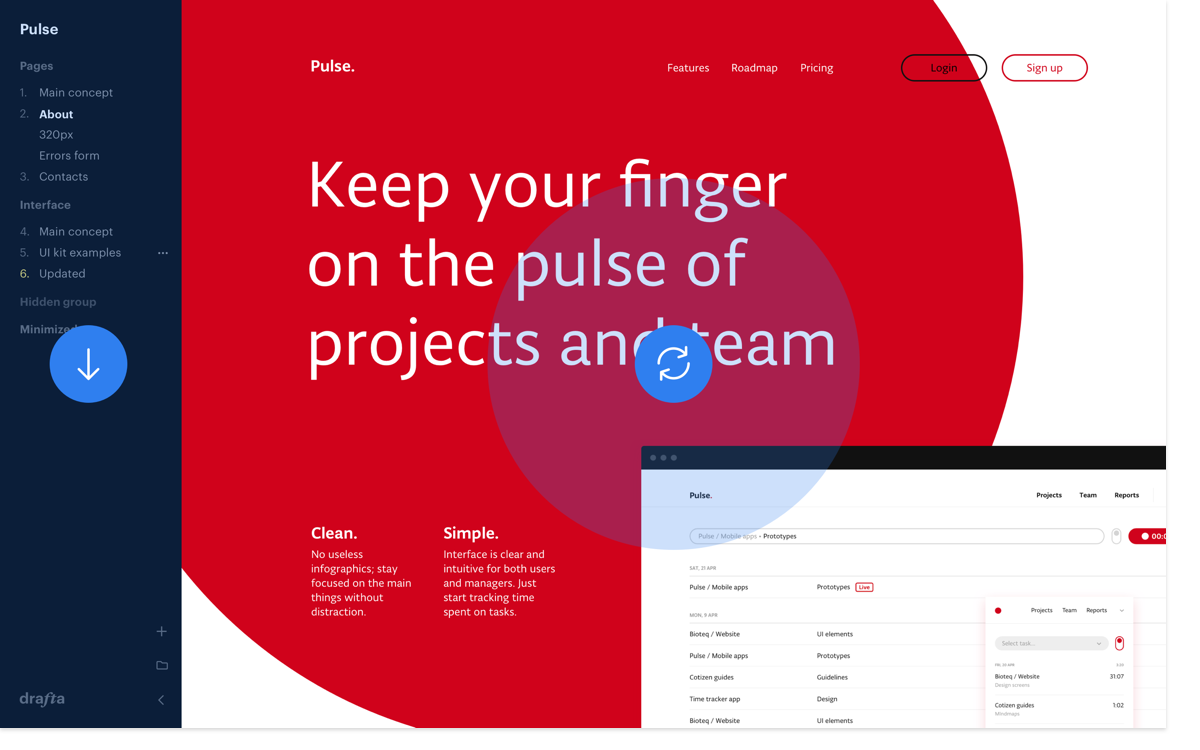
The interface is as neutral as possible in order not to distract from the designs.
Mobile display
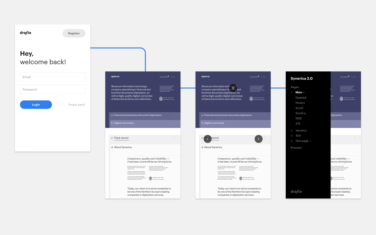
We knew that users often view the desktop designs on their mobile phones. That is why Drafta can adapt depending on the device, giving the user an opportunity to conveniently zoom in and out.
The projects waterfall
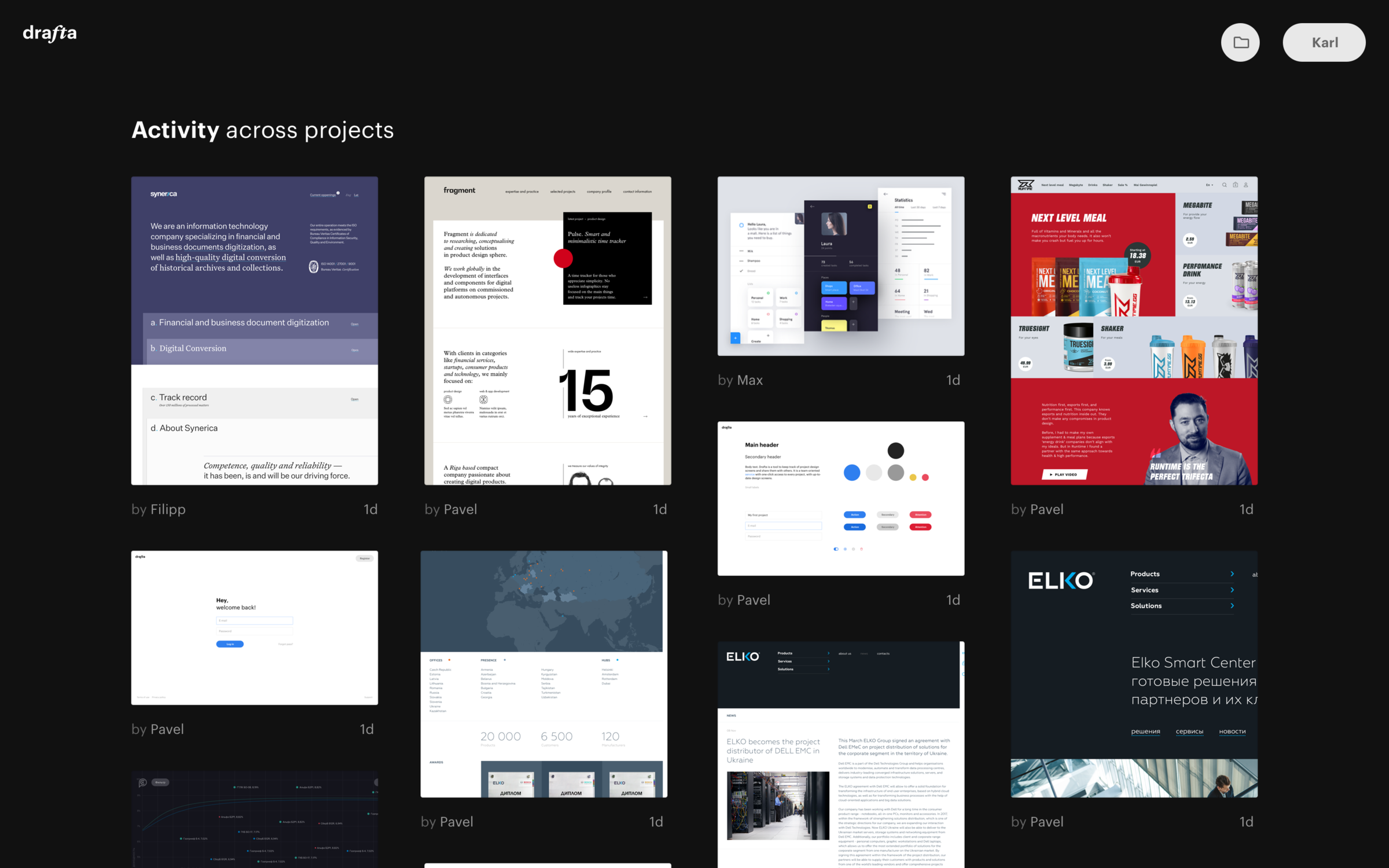
While the project was in development we came up with the idea of an additional section where all the team projects would be accumulated. The preview waterfall can be displayed on a big screen in a design studio so that the team members would see all the projects that are in progress.
The landing page
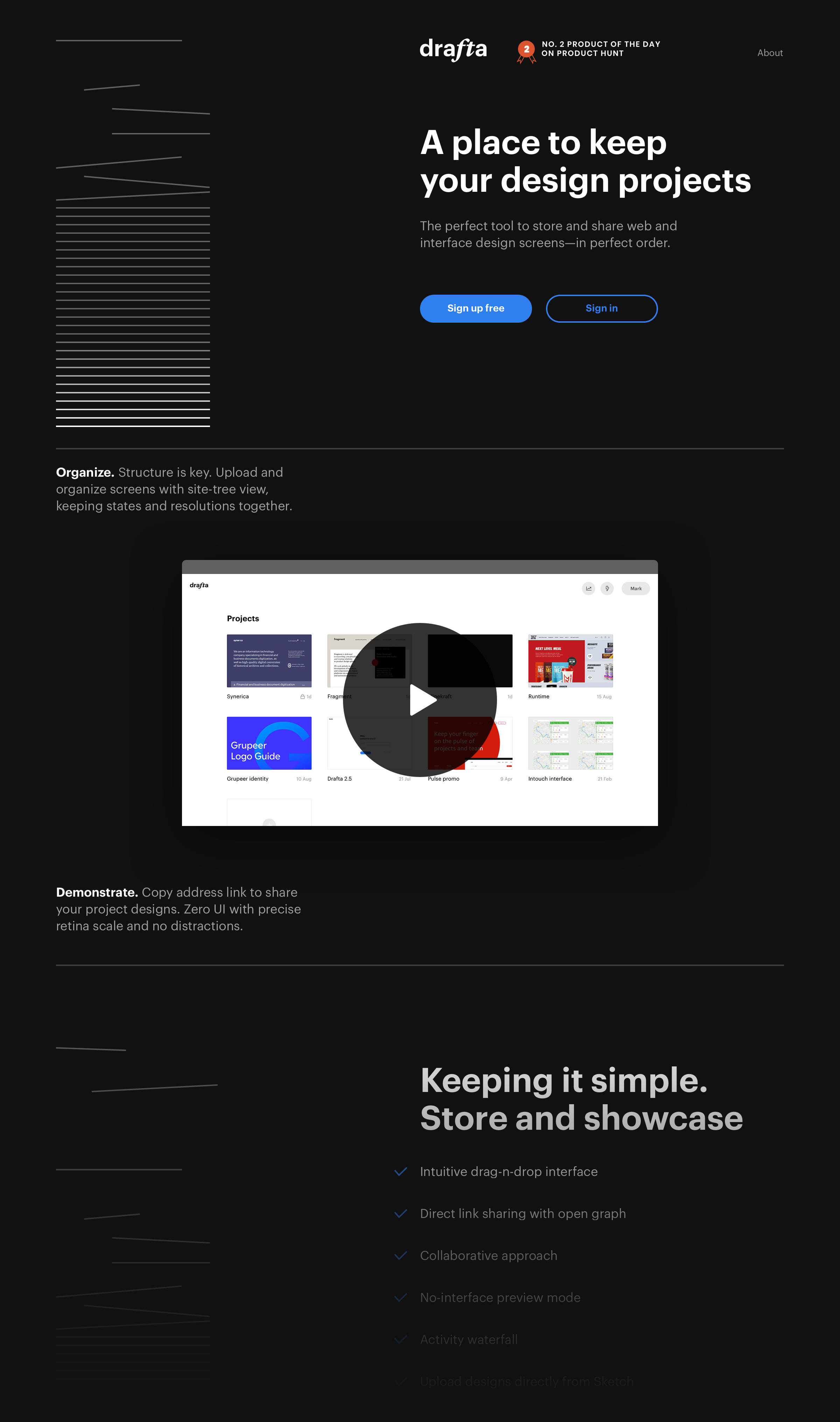
Here we explain and show how to use Drafta. We have made a video that demonstrates the functionality using real projects as examples.
The plugin was featured by Sketch together with products from Marvel, Invision and Zeplin
Project support
We launched Drafta as a minimum viable product — just like we did with Pulse.red. Drafta has been named #2 app of the day on Producthunt, yet we still have improvements to introduce. We communicate with users and gather feedback to construct a roadmap on its basis.
You can find a detailed case study about how we created and built Drafta on Fragment website.